Workshop 4: Modelling and Simulation
Introduction
A scientific model is a mathematical or conceptual representation of a real-world process or phenomenon.
In the previous workshop, we simulated the motion of an object moving under gravity using a simple quadratic equation. The equation was a model of the motion of the object, but in reality it’s only a prediction of the object’s movement.
We can test the model by performing an experiment and comparing the result of the experiment against the prediction of the model. We can think of the model as a ‘scientific hypothesis’ which we confirm or refute based on the results of the experiment, a key component of the scientific method.
In reality we might find that the model is a reasonable appoximation to reality - but by making refinements to the model we can improve its predictive power.
Coming soon
Later you will work in small groups of students to perform a real experiment which tests a model of the motion of an object under gravity.
In this workshop you will make predictions about populations of bacteria using simple quantitative models of population growth.
What you’ll learn
How to model a system using simple difference equations
How to load data and plot it
How to using model fitting to estimate the parameters of a model
Exponential Growth
Bacteria grown in the lab provide an example of exponential growth. In exponential growth, the growth rate of the population is in proportion to the size of the population. Bacteria reproduce by binary fission, and the time between divisions is about an hour.
Suppose we place a 1000 bacteria in a flask with an unlimited supply of nutrients. After one hour, each bacterium will divide, yielding 2000 bacteria (an increase of 1000). After 2 hours, each of the 2000 bacteria will divide, producing 4000 (an increase of 2000 bacteria). After 3 hours, each of the 4000 bacteria will divide, producing 8000 (an increase of 4000 bacteria).
The key concept of exponential growth is that the number of cells added in each generation is in direct proportion to the number cells.
Modelling Exponential Growth
Suppose a population of bacteria belonging to species X doubles in size every hour. Then we can model the population using the following equation:
where \(x_i\) is the population at hour \(i\) and \(r\) is the growth rate. For this scenario, where the population doubles with each step, we set \(r=1\). The equation represents the fact that the population at hour \(i+1\) is \(r+1\) times the population at hour \(i\).
Suppose that the initial population is exactly \(1000\) cells and we would like to simulate the population size over the course of 8 hours.
import numpy as np
import matplotlib.pyplot as plt

r_X = 1
n_hours = 8
initial_population = 1000
pop_X = np.zeros(n_hours + 1)

pop_X[0] = initial_population
for i in range(n_hours):
    pop_X[i + 1] = pop_X[i] + pop_X[i] * r_X

print("Population of species X:", pop_X)
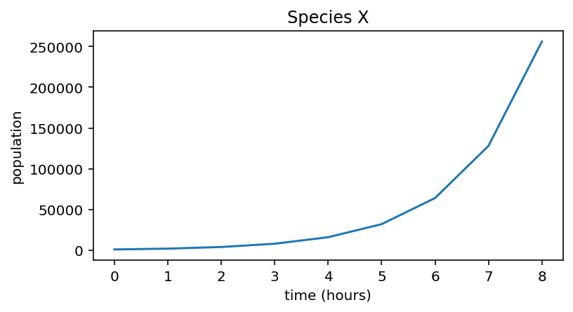
Population of species X: [ 1000. 2000. 4000. 8000. 16000. 32000. 64000. 128000. 256000.]
Note
Python uses exponential notation to express decimal numbers e.g. \(2048 = 2.048 \times 10^3\) is expressed as 2.048e+03.
Using plt.plot we can visualise the population curve over the 8 hours:
plt.figure(figsize=(6,3))
plt.plot(pop_X)

plt.xlabel("time (hours)")
plt.ylabel("population")
plt.title("Species X")
Text(0.5, 1.0, 'Species X')
Now suppose we have another bacterial species Y with a slower growth rate \(r = 0.1\).
Species |
r |
|---|---|
X |
1.0 |
Y |
0.1 |
Use the code above to simulate the growth of population Y.
Plot the predicted population of species Y on a separate figure.
Experimental Data
Eight hour experiment
Now suppose that we perform a laboratory experiment in order to measure the growth in the two species of bacteria. The population of each was recorded every hour for 8 hours.
See also
See here for how you might measure a bacterial population in practice.
Time (hours) |
0 |
1 |
2 |
3 |
4 |
5 |
6 |
7 |
8 |
|---|---|---|---|---|---|---|---|---|---|
Species X population (thousands) |
1.0 |
2.18 |
4.45 |
8.91 |
16.1 |
31.49 |
60.89 |
117.58 |
214.4 |
Species Y population (thousands) |
1.0 |
1.47 |
2.02 |
2.81 |
4.16 |
5.88 |
7.98 |
10.99 |
15.59 |
Let’s plot this experimental data on the same graph as the model simulation.
data_X = np.array([  1.  ,   2.18,   4.45,   8.91,  16.1 ,  31.49,  60.89, 117.58, 214.4 ]) * 1000

plt.figure(figsize=(6,3))
plt.plot(pop_X, label="model")
plt.plot(data_X, label="experiment")

plt.xlabel("time (hours)")
plt.ylabel("population")
plt.title("Species X")
plt.legend()
<matplotlib.legend.Legend at 0x7fa81cec1af0>
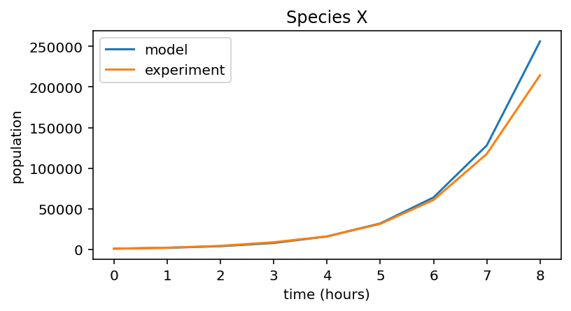
Notice that the the experimental data is a good fit to the model prediction, so at this point we can be confident in our model, and our value of \(r=1\).
On a new figure, plot the experimental data and model prediction for species Y.
You should find that the model and experiment aren’t such a good fit for species Y.
By changing the value of
r_Yuntil the two graphs coincide, determine a good value of \(r\) for species Y.
24 hour experiment
The experimenter continues the experiment for a full 24 hours. The results of the experiment are in the files data_exp_X.txt and data_exp_Y.txt.
We can use the numpy function np.loadtxt to load the data into a numpy array:
data_X = np.loadtxt("data_exp_X.txt")
print(data_X)
[1.00000000e+03 2.17777342e+03 4.44576258e+03 8.91456547e+03
 1.60958432e+04 3.14897238e+04 6.08883077e+04 1.17580768e+05
 2.14397399e+05 3.81989811e+05 6.03315856e+05 7.87285829e+05
 9.96982461e+05 1.04405640e+06 1.08337178e+06 9.95533440e+05
 9.79746583e+05 9.72332987e+05 9.21969859e+05 1.04273060e+06
 9.43221236e+05 9.37714865e+05 9.85877957e+05 1.07409317e+06]
We’ll change the value of n_hours to 24 and re-run the model.
r_X = 1
n_hours = 24
initial_population = 1000
pop_X = np.zeros(n_hours + 1)

pop_X[0] = initial_population
for i in range(n_hours):
    pop_X[i + 1] = pop_X[i] + pop_X[i] * r_X

plt.figure(figsize=(6,3))
plt.plot(pop_X, label="model")
plt.plot(data_X, label="experiment")

plt.xlabel("time (hours)")
plt.ylabel("population")
plt.title("Species X")
plt.legend()
<matplotlib.legend.Legend at 0x7fa81d2e2fa0>
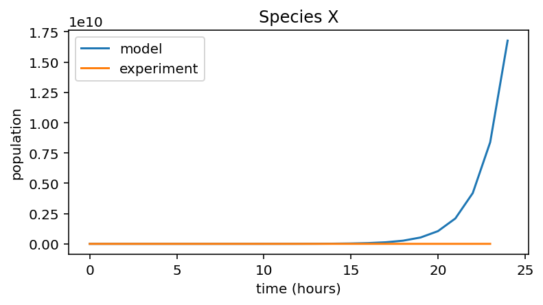
The model and experimental data are no longer a good fit at all. At this scale, it looks like the experimental data is zero for the entire 24 hours. However, to see what’s going on let’s plot the experimental data alone:
plt.figure(figsize=(6,3))
plt.plot(data_X, color='#ff7f0e')
[<matplotlib.lines.Line2D at 0x7fa81d20d370>]
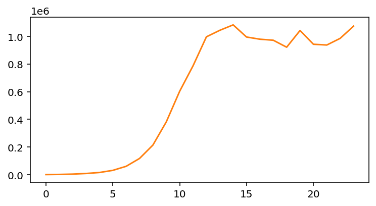
Notice that while the population increases exponentially at first, eventually it stops increasing, likely due to exhausting resources such as nutrients or physical space. Our simple exponential model is insufficient to take this into account.
Instead, we can consider a more sophisticated model, logistic growth.
Logistic Growth
The logistic equation describes the growth of a population where the growth rate is limited by resources.
the growth rate \(r\) has been replaced by the term \(r(1-x_i/K)\). For small populations (when \(x_i\) is much less than \(K\)) the growth rate is close to \(r\). As the population size approaches the value \(K\), the growth rate reduces to zero.
Note
\(K\) is called the carrying capacity.
Simulate the growth of species X use the new equation. You will need to create a new variable
K_Xand change the linepop_X[i + 1] = pop_X[i] + pop_X[i] * r_X. Use the valueK_X = 1e6. Plot the experimental and model prediction on the same graph.
You should find that the two curves fit well, showing that our new model predicts the population growth well.
Repeat the simulation for species Y (Don’t forget to load the 24h experimental data for Y, from the text file provided above!). Determine values of \(r\) and \(K\) that best fit the experimental data. Hint: the value of \(r\) affects the steepness of growth, while \(K\) is related to the point of saturation.
Exercise
The following three text files contain the results of 3 bacterial population growth experiments. For each one, plot the data and by running a simulation for each, estimate the value of \(r\) and \(K\).
data_exp_A.txt
data_exp_B.txt
data_exp_C.txt
Which data file corresponds to which of the three species in the table below?
Species |
r |
|---|---|
1 |
0.4 |
2 |
0.7 |
3 |
0.9 |
Challenge
See if you can use simple functions, loops and arrays to solve this exercise efficiently. If you find yourself repeating the same code over and over, could you use a loop? Try defining a function that takes values for \(r\), \(K\), \(x_0\) (initial population) and n_hours as inputs and returns an array of population values.
Epidemic Model (Optional)
The spread of an infectious disease amongst a population can be modelled by the following pair of coupled equations:
where \(S_i\) represents the number of susceptible (uninfected) people and \(I_i\) represents the number of infected people.
There are two parameters: the recovery rate parameter \(a\) and the infection rate parameter \(b\).
Starting with parameter values \(a = 0.1\) and \(b = 0.00005\) and the initial populations \(S_0 = 20000\) and \(I_0 = 100\), model the infection for 100 days.
What happens as you change the values of \(a\) and \(b\)?
SIR model
This model is called the SIR model which is commonly used to model epidemics such as COVID.
