Figures#
High quality figures are important for scientific reporting, and it is recommended that you export your plots in PDF format for inclusion in your report. The code below will generate a PDF file and save it in the same folder as your code.
import matplotlib.pyplot as plt
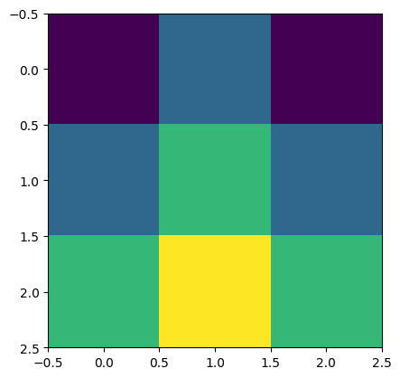
import numpy as np
x = np.array([[0, 1, 0],
[1, 2, 1],
[2, 3, 2]])
fig = plt.figure()
plt.imshow(x)
fig.savefig("square_map.pdf")
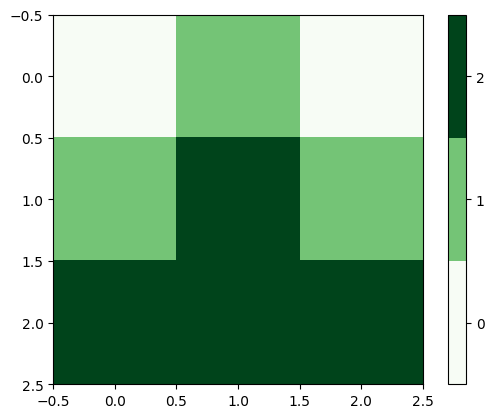
Below shows one way to annotate your plot with a discrete colorbar which acts as a legend.
# use plt.cm.get_cmap(cmap, N) to get an N-bin version of cmap
fig = plt.figure()
plt.imshow(x, cmap=plt.cm.get_cmap('Greens', 3))

# We must be sure to specify the ticks matching our target names
plt.colorbar(ticks=[0, 1, 2])

# Set the clim so that labels are centred on each block
plt.clim(-0.5, 2.5)

fig.savefig("square_map_green.pdf")
Matplotlib is very powerful, and it can be complicated, so you’ll need to dedicate some time to finessing your plots! See the week 5 notes for one way to make subplots.
The online Matplotlib documentation has plenty of examples of a variety of plotting methods.