Graphing data
Contents
2. Graphing data#
[D]ata visualizations tell stories. Relatively subtle choices, such as the range of the axes in a bar chart or line graph, can have a big impact on the story that a figure tells. When you look at data graphics, you want to ask yourself whether the graph has been designed to tell a story that accurately reflects the underlying data, or whether it has been designed to tell a story more closely aligned with what the designer would like you to believe.
This chapter provides some examples of importing and plotting data. After completing the chapter you should be able to:
Use line and scatter graphs to create a visual representation of data
Estimate rates of change using the midpoint rule
Estimate area under a curve by using trapezia
Produce a graph where one or both axes is on a log scale and recognise when this may be useful
2.1. Greenhouse emissions#
The plot below uses data from Our World in Data to show how measurements of CO2 concentration in Earth’s atmosphere have changed since 1960. You can download the dataset used to make this plot from climate-change.csv.
import matplotlib.pyplot as plt
import pandas as pd
import numpy as np

#import the data
df = pd.read_csv('climate-change.csv')
x=df['Year']
y=df['CO2 concentrations']

#plot
plt.plot(x,y)

#prettify
plt.xlabel("Year")
plt.ylabel("CO2 Concentration (ppm)")
plt.xlim([1960,2022])
plt.ylim([300,420])
plt.show()
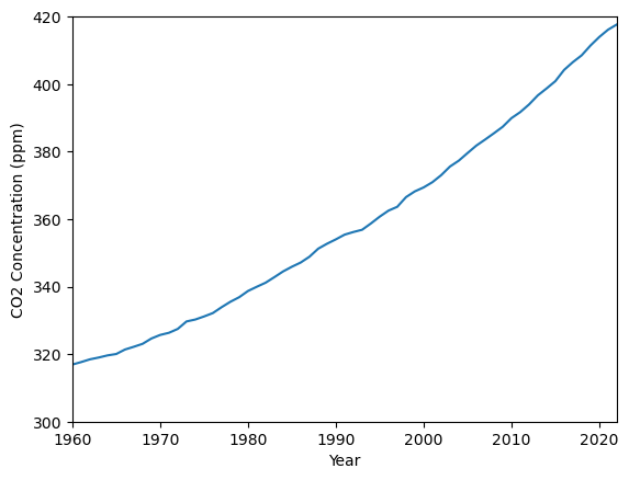
Fig. 2.1 Atmospheric concentration of CO2 (world data)#
Exercise 2.1
Notice that the range of values shown on the y-axis does not start at zero. Do you think this is appropriate for this type of data?
Sometimes, omitting the part of the plot range that starts from zero can be misleading, because it can make a relatively small change appear to be much larger. However, making a line graph’s axis go to zero can sometimes obscure data trends. For an interesting discussion on these points, see [Calling Bullsh*t].
Exercise 2.2
The dataset that the plot is based on includes estimates of the historic CO2 levels going back as far as 800,000BC. Reproduce the plot so that the older historic data is included. Does this second plot make you feel any differently about the trend in atmospheric concentrations of CO2?
Using the same code from above but changing the xlim values gives the following result
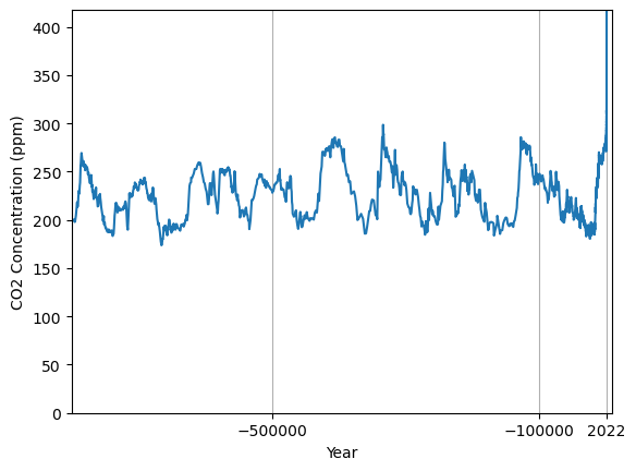
The increase in CO2 concentrations over the last 60 years is even more striking when contrasted against the historic trend over a period of almost a million years.
2.2. Trust in government#
“Do you trust the government?”
This question (or some variant of it) is reported on by many major organisations including the OECD, Gallup (US) and ONS (UK). The dataset used in this example are obtained from NatCen (UK). Responses are shown for the percentage of survey respondents who answered that they trust government to place needs of the nation above the interests of their party “just about always” or “most of the time”. The data used to produce this plot (which you will need to answer the exercise) can be found at gov-trust.csv.
import matplotlib.pyplot as plt
import pandas as pd
import numpy as np

#import the data
df = pd.read_csv('gov-trust.csv')
x=df['Year']
y=df['% agree']

#plot
plt.plot(x,y,'o-')

#prettify
plt.xlabel("Year")
plt.ylabel("%agree")
plt.xlim([1986,2021])
plt.ylim([0,100])
plt.show()
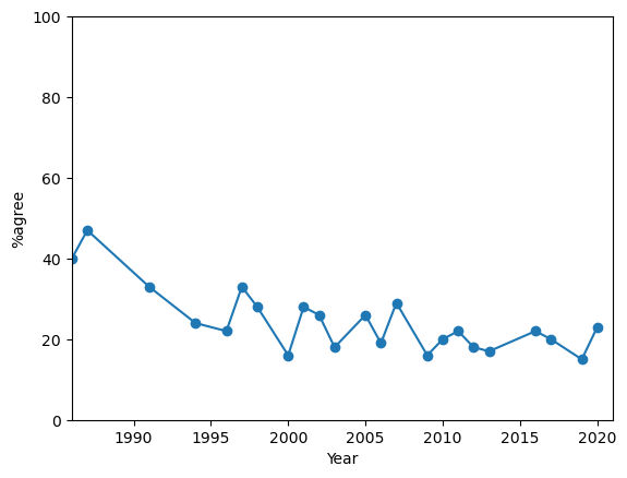
Fig. 2.2 Percentage of UK survey respondents who answered that they trust government to place needs of the nation above the interests of their party “just about always” or “most of the time” Democracy.#
Exercise 2.3
By looking at the values in the dataset, answer the following questions:
By how many points did the %agree response change between 1987 and 1991?
What was the yearly average change in %agree between 1987 and 1991?
What should we say was the yearly average change in %agree for the year 1991?
Between 1987 to 1991 the %agree fell by 14 points. The average yearly change (yearly “rate of change”) in this period was -3.5 points, which is the slope of the line connecting the two data points.
We can calculate the slope of every line using the code below. Then k[1] gives the slope of the second line segment, which we were interested in here.
dx=np.diff(x)  #array of differences between each pair of x values
dy=np.diff(y)  #array of differences between each pair of y values
k=dy/dx        #ratio of differences
A sensible answer to the yearly average change (yearly rate of change) in %agree for the year 1991 might be to take the average of the yearly average changes either side of it. This best estimate is known as the midpoint rule.
(k[1]+k[2])/2
-3.25
If you want to practice plotting and investigating some more sociological datasets, there are several in the NatCen reports on [Democracy], [Culture Wars] and [Taxation, Welfare and Inequality].
2.3. Gini coefficient#
The Gini coefficient is a measure of income inequality. It is based on the share of income received by each income bracket.
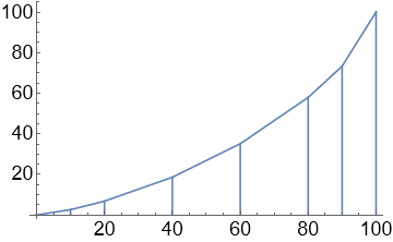
By way of example we will consider UK statistics for the year 2017, which are given in the table below. Data were obtained from World Bank Poverty and Shared Prosperity information, Table 1.3. If you wish, you can repeat this exercise using data from another country. A plot of the UK data are shown in Fig. 2.3, along with the “line of equality”.
% of population |
% of income |
|---|---|
Bottom 10% |
2.6 |
Bottom 20% |
6.8 |
Bottom 40% |
18.6 |
Bottom 60% |
35.1 |
Bottom 80% |
57.9 |
Bottom 90% |
73.3 |
import matplotlib.pyplot as plt

#UK dataset
x = [0,10,20,40,60,80,90,100]
y = [0,2.6,6.8,18.6,35.1,57.9,73.3,100]

#plot
plt.plot(x,y,label='UK population data')
plt.plot([0,100],[0,100],label='line of equality') # y=x

#prettify
plt.xlabel("% of population")
plt.ylabel("% of income")
plt.xlim([0,100]); plt.ylim([0,100])
plt.legend(); plt.show()
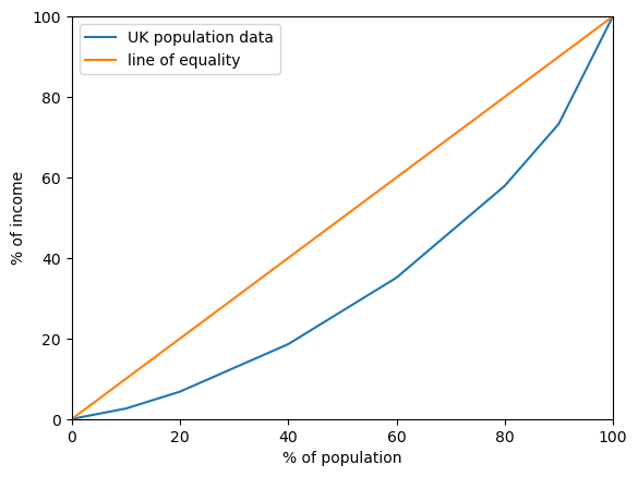
Fig. 2.3 Income equality in the United Kingdom#
Exercise 2.4
Explain why the line \(y=x\) is called the line of equality.
In an equal society each percentage bracket of the population should earn the same share of income.
The difference between the line of equality and population data is due to income inequality. Thus, to quantify the size of the inequality we can measure the difference between the line of equality and the actual population data. The larger the area enclosed, the greater the inequality.
Technically, by calculating area we accumulate the difference between the two curves, treating the data as continuous.
Exercise 2.5
Calculate the area under the enclosed between the two curves shown in Fig. 2.3.
Hint: The formula for area of a trapezium will come in handy here.
The area between the two curves can be calculated by subtracting the area under the data curve from the area under the line of equality.
The area under the line of equality is simply the triangle area
The area under the data curve is given by adding up the areas of the trapezia shown
The area of a trapezium is given by the average height multiplied by width, which can be written as \(\frac{1}{2}(a+b)h\) with reference to the trapezium below:
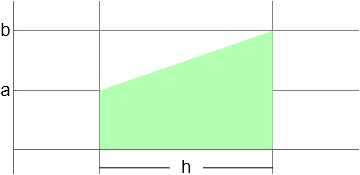
# area of a single trapezium
def trap(i):
  h=x[i+1]-x[i]   #width
  a=y[i];         #left y value
  b=y[i+1];       #right y value
  A=(a+b)*h/2
  return A

# get each trapezium area
T=[trap(i) for i in range(len(x)-1)]
sum(T) #total area
3303.5
The same result can also be obtained by using the trapz function from the numpy library:
import numpy as np
np.trapz(y,x)
3303.5
Therefore the area between the two curves is given by
The area between the two curves cannot be larger than the total area under the line \(y=x\). Therefore, we can scale the result to a value in the range [0,1] by dividing by this area. The scaled value is called the Gini coefficient. A larger value of the Gini coefficient implies greater inequality. Our estimate for the UK data gives a Gini coefficient of 33.93. This result is quite close to the value of given by the World Bank, which is 35.1.
Historic Gini coefficient values can be downloaded from The World Bank. The dataset is not complete, but for many countries these is enough information available to recognise trends. The UK data are shown in the plot below.
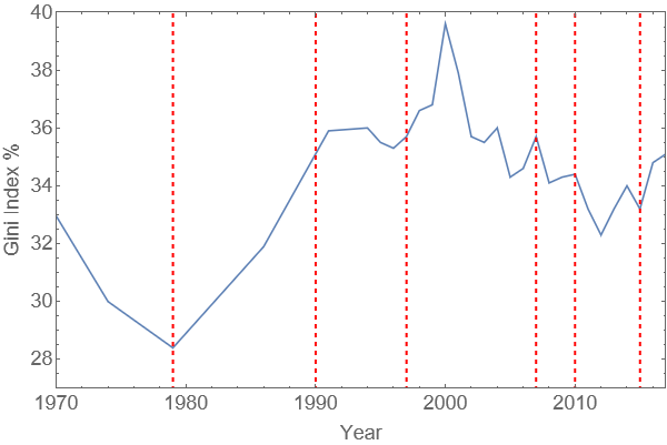
Fig. 2.4 UK Gini index over time. Dashed lines indicate changes of government.#
2.4. Molecular binding#
A biological sample with a concentration of \(N\) receptors per mg of tissue is immersed in a solution containing a drug (ligand) at concentration \(c\).
According to the ‘lock and key’ model, the ligand (key) binds to the receptors (locks) in proportion to the concentration of receptors that remain free and to the ligand concentration. We may write this as follows where \(N_b\) is the concentration of bound receptors, \(N_f\) is the concentration of free receptors, and \(k_a\) is the constant of proportionality for the reaction, which is called the affinity constant:
Since \(N=(N_b+N_f)\), we may rearrange this formula to obtain
The value \(k_d\) appearing in the rearrangement is called the dissociation constant. Notice that \(k_d\) must have the same dimensional units as \(c\) in order for the units in the equation to balance. The concentration is typically measured in molarities (M=mol/l). For more information, see (e.g) this paper
Exercise 2.6
Taking \(k_d=0.05\text{ nM}\) and \(N=1.4\text{ pmol/mg}\) :
Make a plot of \(N_b\) against \(c\)
Estimate the concentration \(c\) when half the receptors are occupied
import matplotlib.pyplot as plt
import numpy as np

#parameters
N=1.4; kd=0.05

#plot
c=np.linspace(0,10,100)
Nb= N*c/(kd+c)
plt.plot(c,Nb)

#prettify
plt.xlabel('$c$ (nM)')
plt.ylabel('$N_b$ (pmol/mg)')
plt.xlim([0,10])
plt.ylim([0,1.45])
plt.show()
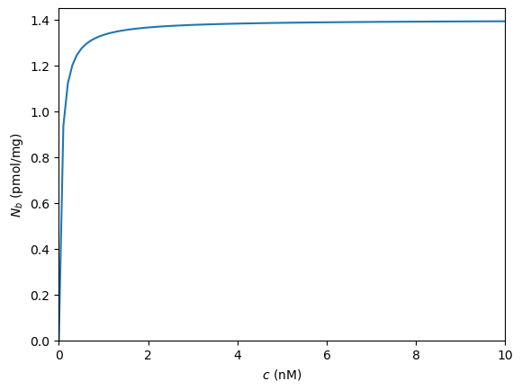
It can be seen that the receptors approach full occupancy \(N_b=N\) as the concentration increases. This can be anticipated from (2.2), by writing
As \(c\) becomes very large, the ratio \(k_d/c\) becomes very small. For instance, when \(k_d=0.05\) and \(c=10\) this ratio is just 0.005 and so \(N_b=N/1.005\). As \(c\) gets larger, \(N_b\) gets closer to \(N\). We will examine this idea in more detail when we study limits.
At half occupancy, \(N_b=N/2\), which gives
We see that the dissociation constant has the nice property that it is equal to the concentration at which half the receptors are bound.
It would be nice to illustrate this on the plot, but everything is bunched up near to the left-hand side. We can spread things out by plotting the horizontal axis values on a logarithmic scale, as shown below:
#plot
c=np.logspace(-4,1,1000)  # range [10^-4 to 10^1]
Nb= N*c/(kd+c)

#prettify
plt.semilogx(c,Nb)        # display on a log scale
plt.xlim([1e-4,10])
plt.yticks([0,N/4,N/2,3*N/4,N])
plt.show()
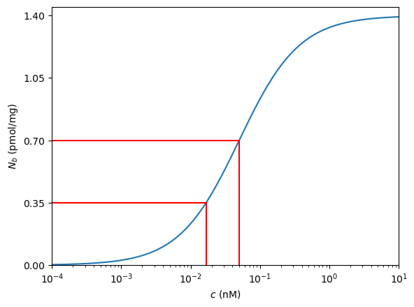
The semilogx plot type scales the horizontal axis so that powers of 10 are equally spaced\(^*\). This is useful for reading off data at lower concentrations.
The red lines have been added to the plot to indicate the concentrations required for \(N_b=N/2\) and \(N_b=N/4\). The code to produce them has been omitted. Could you figure out how to do it?
\(^*\) semilogy scales the vertical axis and loglog scales both axes.